


In my sideline work as a photo illustrator/digital artist (TuTchT IMAGING ), I focus my work mainly on young males of color in the fashion and entertainment industries. This path has led to connections with lots of great talent…including photographers. When it came time to develop some new concept art and our new logo, 2 photogs offered their assistance on a collab. Just wanna give them their props.
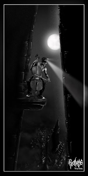
While looking through the portfolio of Parisian photog Michael Cruzz I saw a series of rooftop shots he had taken. In both Paris and NYC, Michael always finds models, locations and concepts that combine urban rawness, masculinity & a deeper contemplative vibe than what you typically get in fashion photography, and always without feminizing his models or making them so abstract they lose their realness. I saw this particular shot and immediately knew it had the potential to capture the raw street vibe & the movement-oriented nature of our show. The pose itself captured the “I don’t give a fuck” playing-with-danger quality that permeates “Roofless.” I knew if that same pose were positioned on a precarious ledge it would amplify that feeling even further.
 |
| Model Mike Press, Paris by Michael Cruzz, NYC/Paris |
I contacted Michael (and model Mike Press) for permission. Michael was diggin the idea. So I set to work. After hours of TuTchTness, trail and error, we came out with an image that was everything we hoped for. Michael was pleased with the outcome…and we obviously were as well. This image became the picture-worth-1000-words to represent “Roofless.”
 |
When we decided the best single visual image to sum up the innovative nature of the show was the character “Tagz” in flight, we set out on a long mission to find the right model who captured the combination of qualities: impish, boyish, a Hip-hop head, other worldly, slightly melancholy but full of mischief, and preferably a particular ethnicity that immediately read as in-the-moment “urban” but also called up images of ancient, spiritually-knowing cultures. A young innocent from a wise race of knowing beings. (basically an updated “Pan”) Not to put anyone on blast, lol, but after several months of trying to get a couple of Tulsa models to return emails and show up for appointments, hahaha, we started looking into the larger model world. (We always TRY to represent our Tulsa fam whenever we can.)
Then it hit me that model Stephen Christopher was perfect. This was a guy I had been watching for some time, he was native of Ohio, and well on his way to a career. At that time he was counting the days until he graduated so he could make the move to NYC. His ethnic mix of African-American, Asian & Native American summoned up everything we were going for. He was a bit of a dancer so I knew he could deliver.
 |
| Being a great model, Stephen gave us a variety of facial expressions that called up different character vibes. |

Enter “The PhotogJ” ... I was first introduced to Stephen through a series of great shots in J’s portfolio and they had been working together since square one. I had also watched J’s skills develop since he first jumped into photography several years prior. I knew he could pull off the photography we needed. And when I pitched the idea to him he totally got it and was excited by the challenge. I sent them a series of sketches of poses that we felt would create the illusion of “Levi-breaking” (The character of “Tagz” does a combination of flying & Break dancing, propelling himself with spray cans he uses like jet-packs)

They came through like woah! J delivered around 60 well shot raw images from their photoshoot and I couldn’t have been happier with the results. They executed every sketch and added a host of other shots, all of them in perfect character and tone.
 |
| Stephen "flies" in this unedited shot by the Photog J |
Next came hours…okay, I’ll be real…weeks… of working digital magic on the set of images. Picking just the right shots, with the right background, shifting arms and legs slightly for a perfect composition, designing the new “Roofless” font, figuring out how to create believable spray patterns, drips, whooshes, et al., chosing a color palette, sparkle trail or no sparkle trail, lol…etc etc etc. Trying to make it all come together and look effortless…innovative and familiar at the same time. This picture had to capture the unique balance of magic fantasy and gritty rawness that is “Roofless.” A Hip-hop fairytale. We feel like we finally arrived there with the image. It graces our blog header & in our NYC premiere it became a much-talked-about symbol of this innovative new style of musical theatre.
 |
| An early, unused color test for our Tagz logo art |
At first we wanted Tagz to have an other-worldly skin color. We had settled on blue then frikkin Avatar comes out and it looks like we’re biting…so we experimented with green in this shot. Uh…too Martian. lol
So we stuck with real skin color and decided to put everything in a dark, gritty, almost Film Noir palette – basically black and white with blood-red accents. That seems to hit the mark perfectly.
To see the final image…jus raise yo headz ya’ll.
HUGE thanks to PhotogJ, Stephen, Michael & Mike for donating their skillz to help us put imagery to our bizarre ideas. hahaha. They are truly Roofheadz at heart and we’re blessed to have had our creative paths cross. (I continue to work with these talented artists whenever I can…and you should too! Hit em up.)
No comments:
Post a Comment